Search

Archive

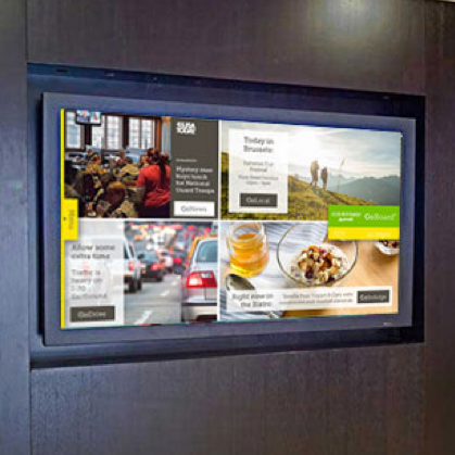
ClearChoice Sales Dashboard

ClearChoice is a dental lab with locations across the country, dealing in a highly technical and fast-paced industry. As practitioners work alongside sales representatives, seeing dozens of patients per day, it was imperative to the company leadership to create a tool that team leaders could use to motivate and educate their employees during daily stand-ups and throughout the day. After working with ClearChoice leadership to learn about overall goals and metrics, I created a mood board of ideas as a starting point. Then, I conducted a UX Studio to bring stakeholders...

Marriott GoBoard

The GoBoard is a digital, brand-standard solution that been used in Courtyard by Marriott hotels for over a decade. When I became involved, the application was ready for an overhaul to match the new demographic, brand goals and redesign. Rather than just refreshing the dated design, I took a step back and worked with my team and Marriott Corporate to re-imagine the way the GoBoard functioned. Our initial goal was to move away from the busy, one-screen approach that had dominated the solution for years, and simplify it into a full-screen,...

Daimler Employee Wayfinder

As Daimler Trucks North America geared up to unveil a sophisticated new headquarters, they knew that the move of hundreds of employees to the new space would be no easy task. In order to make the transition as smooth as possible, the opening coincided with the implementation of these employee kiosks, to replace what had been done with paper signage in the previous location. Employees can now search for colleagues, conference rooms and amenities and receive directions with the push of a button, in addition to other pertinent information such...

Honda Car-Finder

Honda Latin America was searching for a tool to help their customers explore dealer offerings and make decisions on-site. I designed this multi-lingual user experience, a touch screen that would allow individual Honda dealerships to showcase the features that set their cars apart, as well as provide users with a way to virtually "build" their dream vehicle based on available inventory. ...

VisitBreck Website

VisitBreck is an online booking engine for high-end vacation homes in Breckenridge, CO. While the site was in need of a visual overhaul, the performance metrics were of much higher concern, pointing to a bigger picture issue. After an extensive research and discovery process, I led a team to develop a new design and user experience that vastly outperformed the previous version of the site, at a success rate of over 105% in increased total conversions, year over year. Additionally, the new site was infinitely more scalable, allowing us to easily...

Mazda Dealership Experience

Mazda North America was looking for a way to elevate the customer journey within their dealerships. In addition to a revamped showroom, they sought an interactive experience that would give their customers insight into the brand, as well as the confidence to purchase a Mazda vehicle. The final solution that I designed alongside their stakeholders and company leadership became a centerpiece for the new and improved dealership experience. A key element in the sales process, we avoided a simple touch-screen regurgitation of the Mazda website, but instead created a fully-immersive...

Preview of Red Canary mobile site redesign

Red Canary Mobile Site

The public-facing mobile site at Red Canary had been a long-neglected component of the overall web experience, despite being accessed by an average of 40% of all users. I led the charge to make a deliberate move from a desktop-first focus, implementing some simple updates to drive an uptick in conversion on mobile devices. We tightened up spacing to better maximize the mobile screen real estate, adjusted the hamburger nav to be more intuitive, and most importantly added a prominent and persistent CTA to the bottom of the screen. Ultimately,...