Red Canary Mobile Site
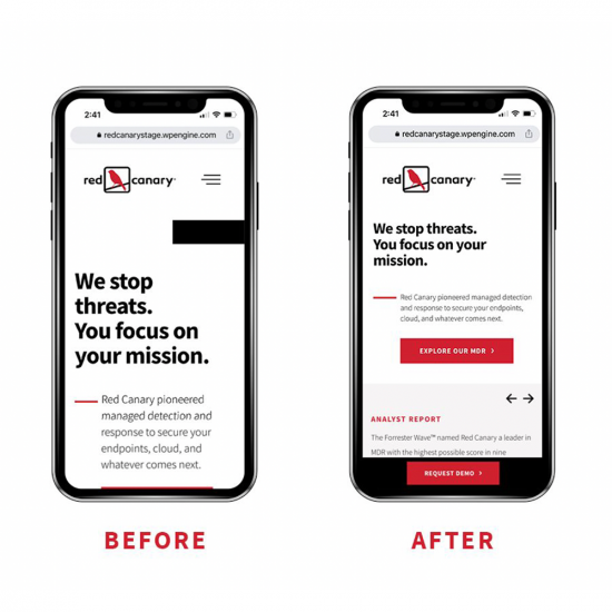
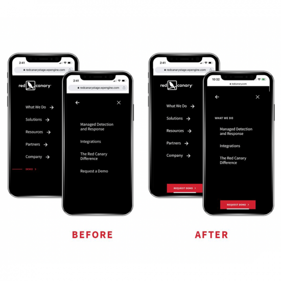
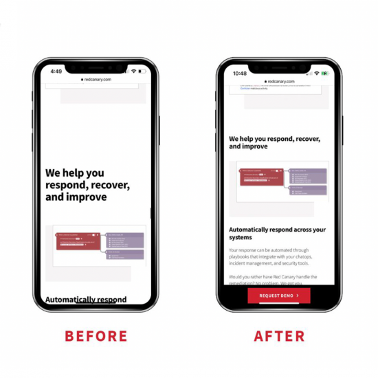
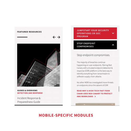
The public-facing mobile site at Red Canary had been a long-neglected component of the overall web experience, despite being accessed by an average of 40% of all users. I led the charge to make a deliberate move from a desktop-first focus, implementing some simple updates to drive an uptick in conversion on mobile devices. We tightened up spacing to better maximize the mobile screen real estate, adjusted the hamburger nav to be more intuitive, and most importantly added a prominent and persistent CTA to the bottom of the screen. Ultimately, these small changes resulted in measurable increased engagement and conversions, notably a 32% increase in session duration, and 62% increase in visits to the key conversion (demo) page.
View the full case study here