A fast-paced industry needed a tool that could keep up
ClearChoice is a dental lab with locations across the country, dealing in a highly technical and fast-paced industry. Leadership needed a tool that team leaders could use to motivate and educate their employees during daily stand-ups and throughout the day.
The goal was a dashboard that surfaced the right information at the right moment: performance data that could drive conversations, keep teams aligned on goals, and give leaders a clear picture of where their teams stood without needing to dig for it.
Starting with leadership goals and working inward
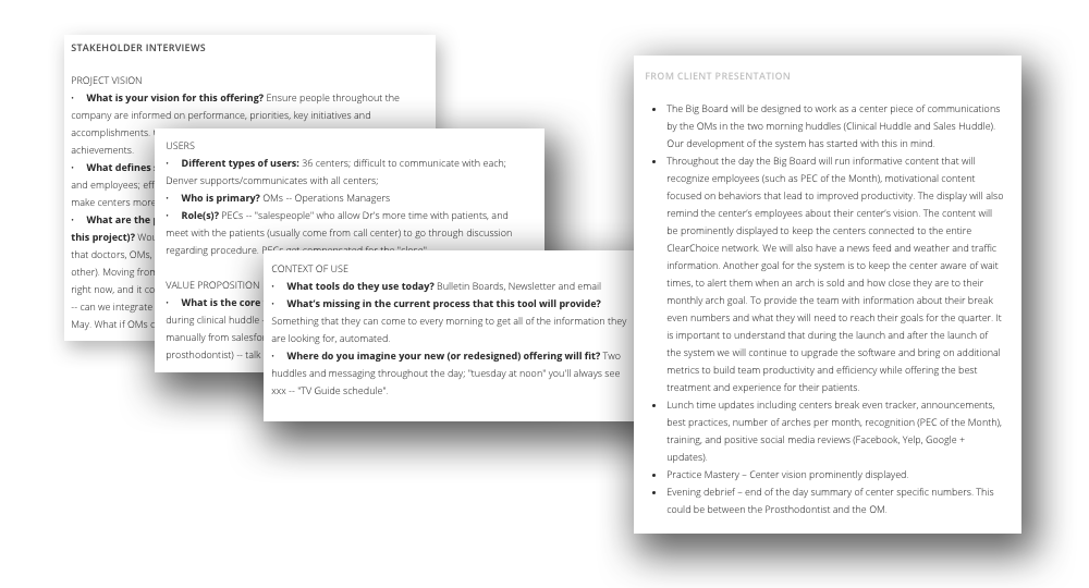
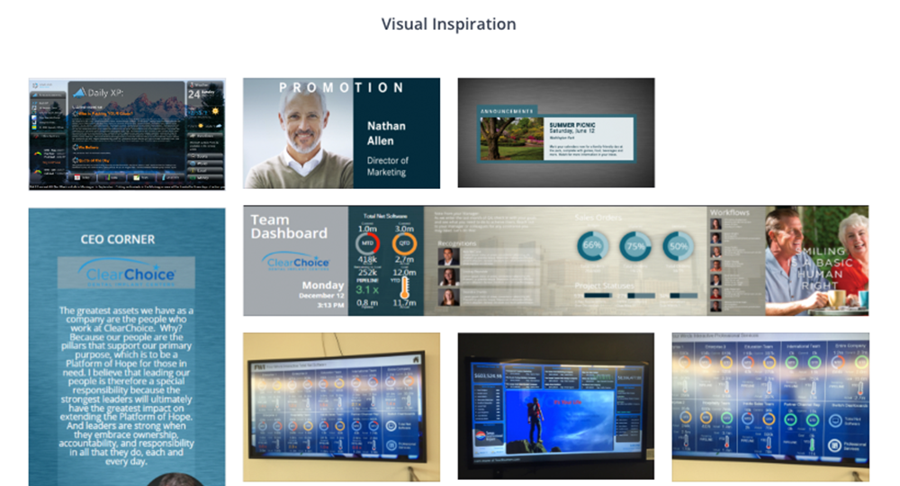
The discovery process began with leadership to understand the goals and metrics that mattered most across locations. From there, a mood board established the visual direction before any wireframes were drawn, giving stakeholders a shared reference point for the feel and tone of the experience.
A cross-functional UX Studio brought in stakeholders from across the organization to surface what team leaders actually needed at a stand-up, what motivated their teams, and where the existing process fell short.
From wireframes to an interactive experience
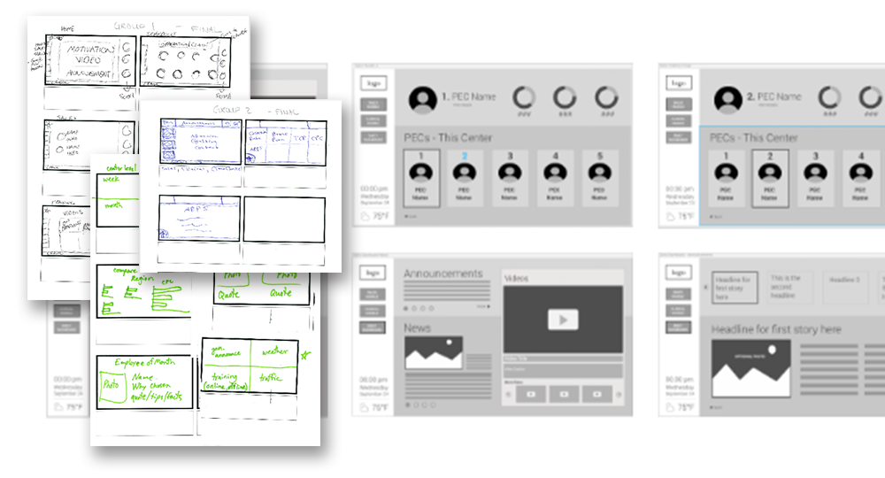
Wireframes translated the discovery findings into a structured layout, defining how different views would relate to each other and how team leaders would move through the tool during a stand-up versus during the rest of the day. The interactive prototype gave stakeholders a tangible sense of the flow before final visual design began.
Four views designed to work together
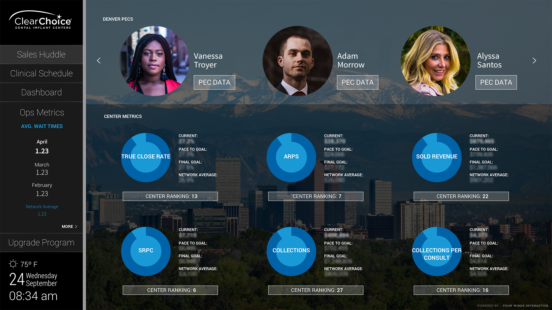
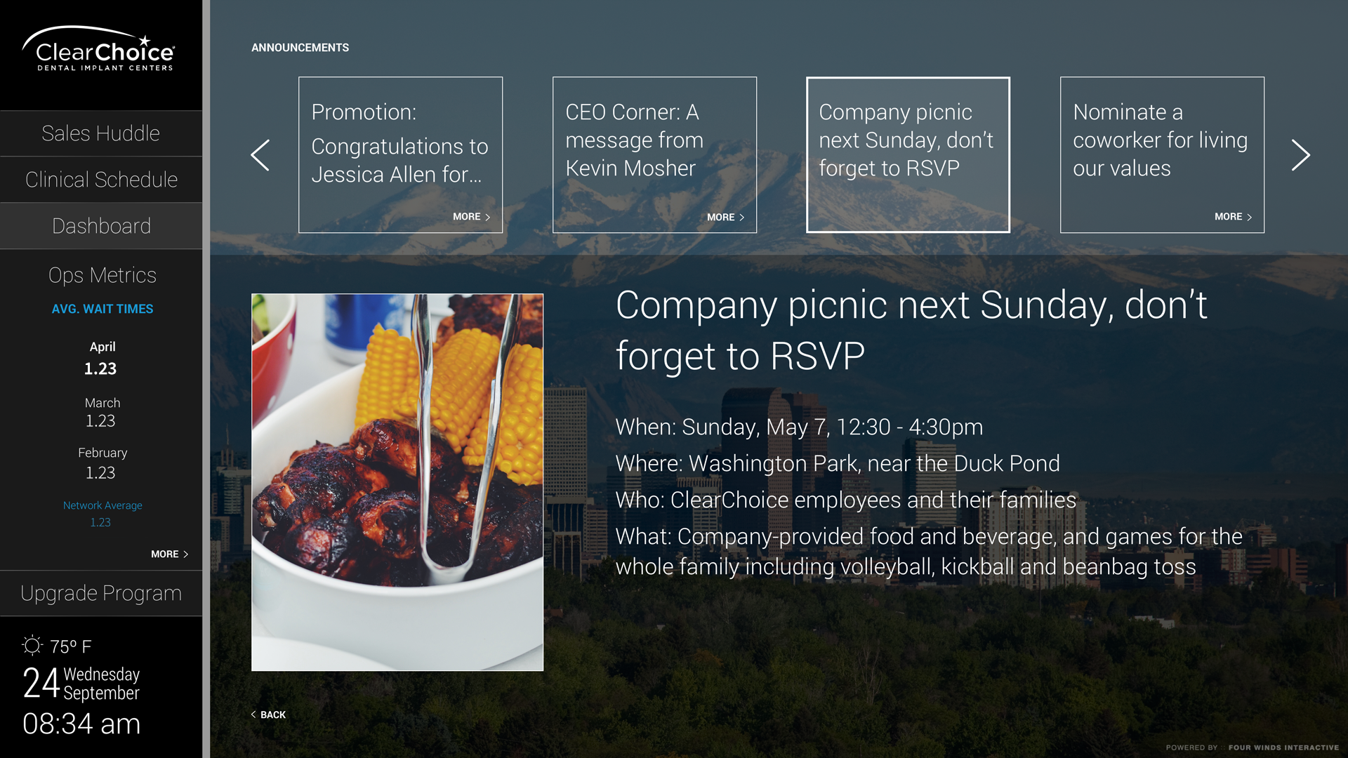
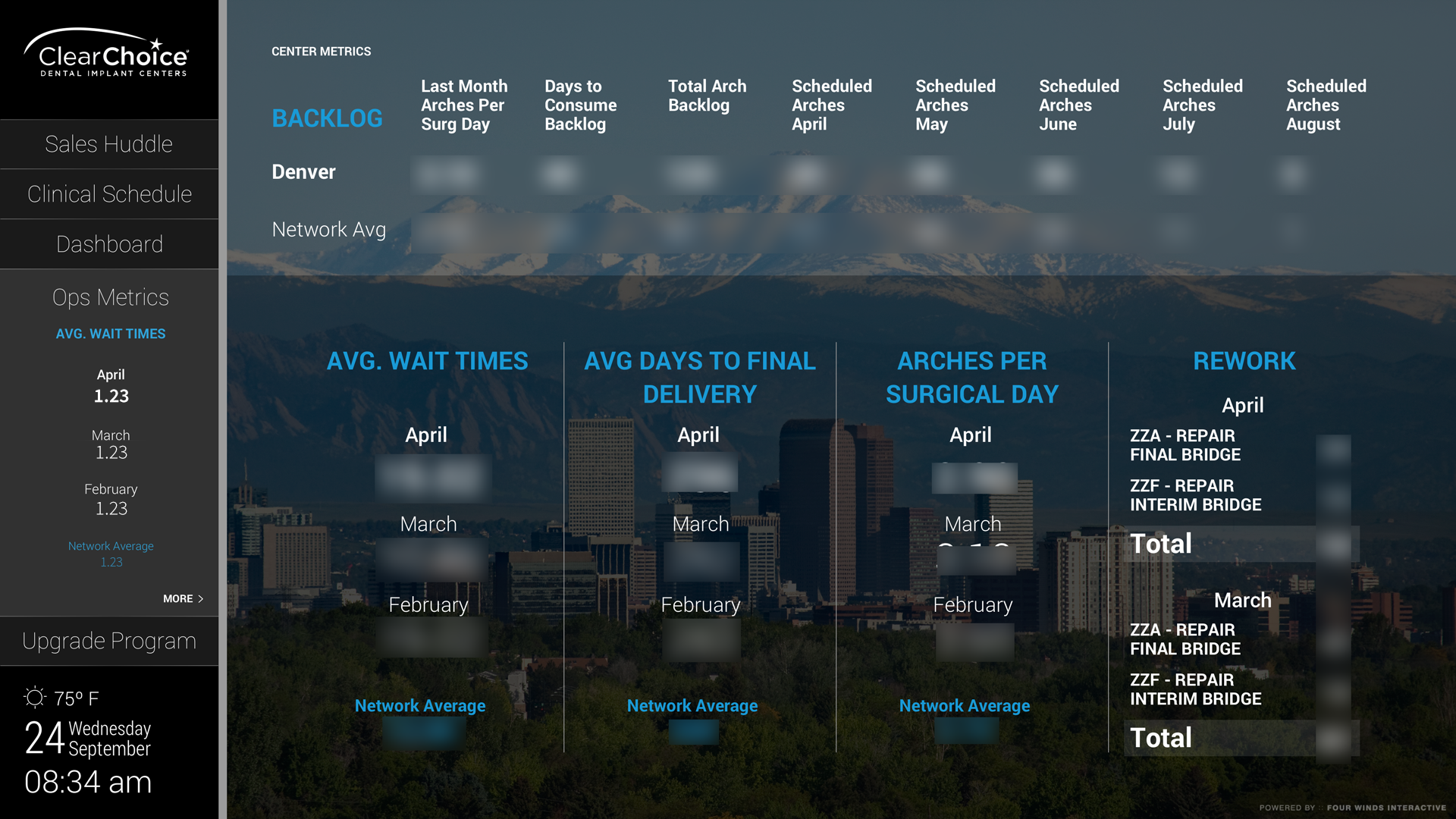
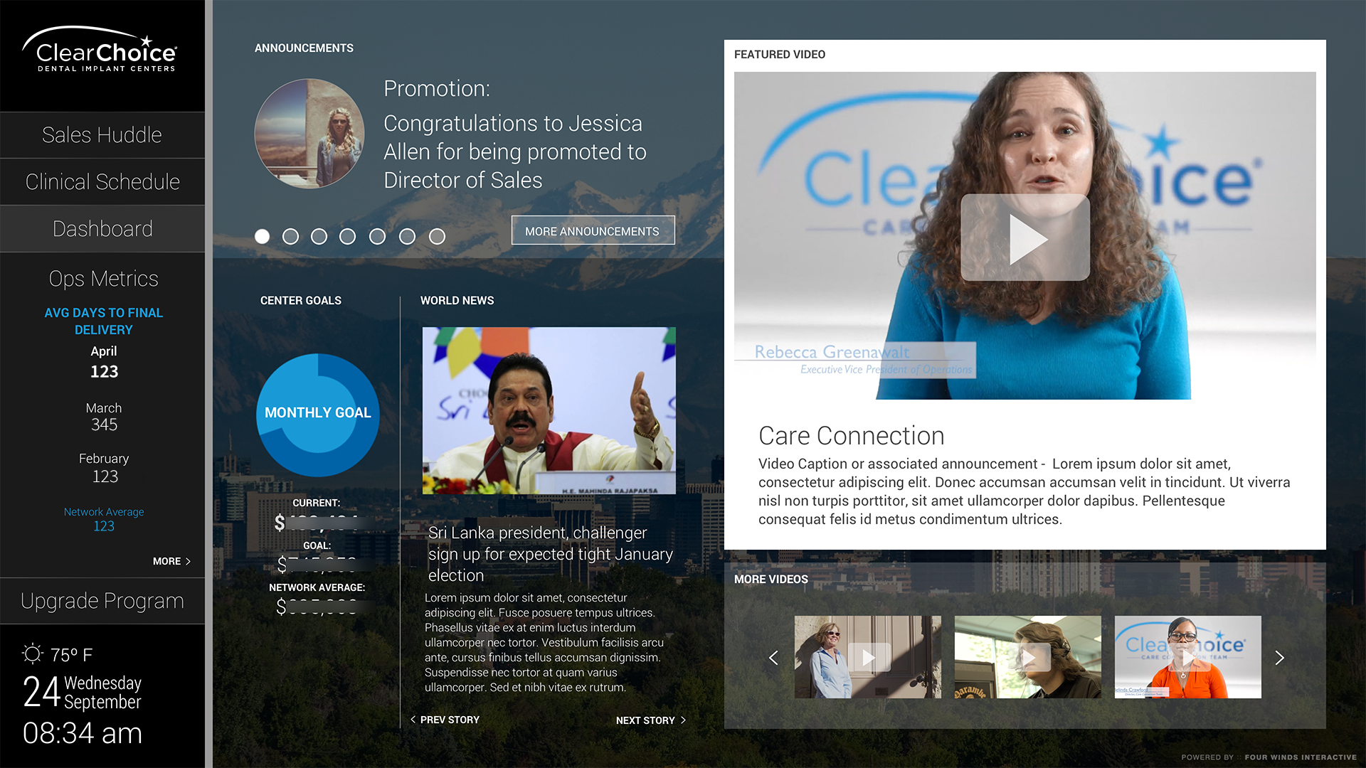
The final dashboard brought together performance metrics, team announcements, individual results, and the stand-up sales huddle view into a single cohesive tool. Each view was designed for a specific moment in a team leader's day, with the data and context they needed to have a productive conversation with their team.