A high-traffic channel left behind
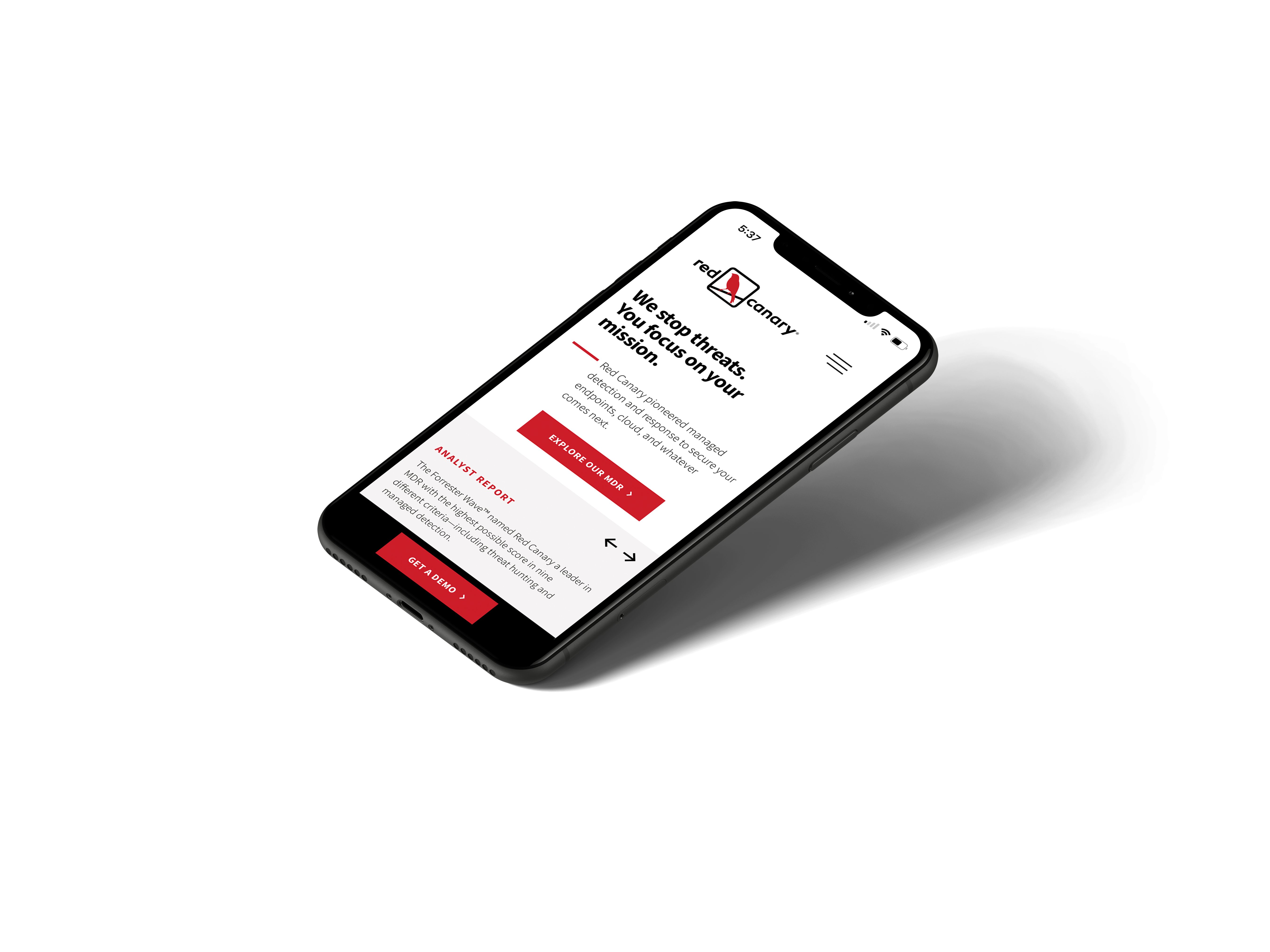
Red Canary's public-facing website was built and optimized with a desktop-first mindset, a common pattern for B2B companies targeting enterprise buyers. But the data told a different story: 40% of all visitors were arriving on mobile devices, and the experience wasn't meeting them where they were.
I proposed the initiative myself after digging into site analytics. I wasn't proposing a full build, but rather a deliberate, evidence-based intervention to unlock conversion potential that was already within reach, and to prove that a neglected channel was quietly costing the business.
40% of users were arriving on mobile and we were essentially sending them through a side door.
A self-proposed initiative in a resource-constrained environment
Mobile was never on the roadmap, as Red Canary was laser-focused on its core product and enterprise sales motion, and the marketing site was maintained reactively rather than strategically. I identified the opportunity through analytics and brought the case to leadership myself.
Getting buy-in was an uphill climb. Mobile UX for a B2B website wasn't seen as a high-priority investment at Red Canary, and there was no dedicated headcount or budget attached to it. Rather than let it stall, I absorbed the work into my existing workload because I believed the potential impact was too significant to leave on the table.
Key Constraints
No dedicated budget or executive sponsorship at the outset. Work was layered on top of existing commitments. The external dev team had limited availability, so designs needed to be precise and minimal in revision cycles. These pressures pushed me toward high-confidence, high-leverage changes rather than an exploratory overhaul.
What was broken and why it mattered
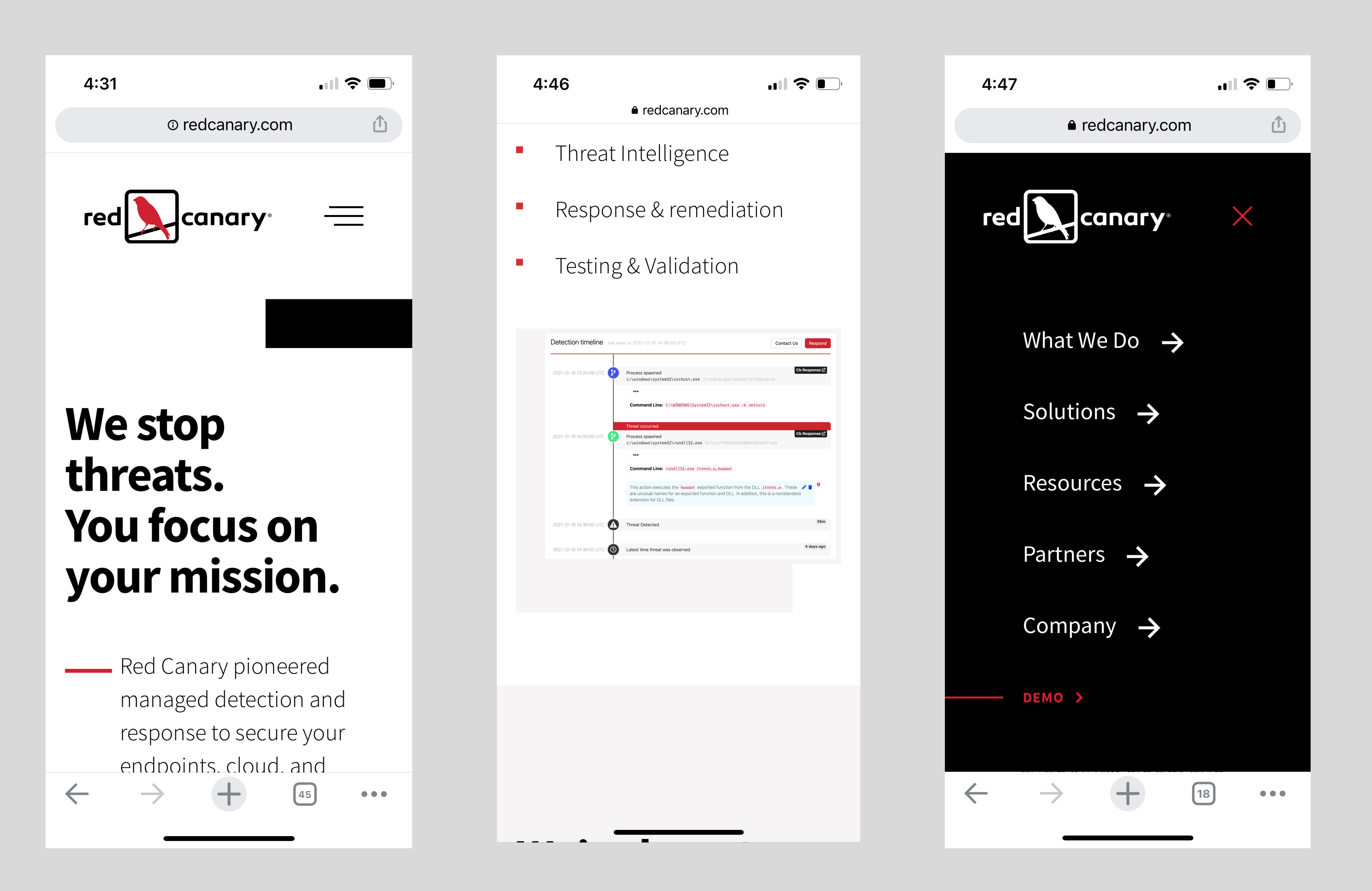
A UX audit of the mobile experience surfaced several friction points that were quietly eroding engagement and conversion for a significant portion of visitors. As opposed to edge cases, they were structural issues that made the site frustrating to use for the 40% of users arriving on a phone.
Unintuitive Navigation
The hamburger menu was hard to discover and awkward to use. Users were exiting rather than exploring, and session recordings showed repeated failed attempts to find deeper content.
Poor Screen Utilization
Desktop layouts simply scaled down, wasting precious mobile real estate and forcing excessive scrolling to find key content. The experience felt like a shrunken afterthought.
No Persistent CTA
The primary conversion action, requesting a demo, was buried. Users who were ready to take action had no low-friction path to do it, so the moment of intent had no outlet.
Inconsistent Spacing
Unoptimized padding and margins created a cramped, hard-to-scan experience. The visual density undercut trust in the brand and made it harder to absorb key messaging.
Starting with what the data revealed
Before proposing any changes, I grounded the project in behavioral data. While generally a good practice and part of my standard process, it was also the only way to get leadership attention at Red Canary, where design recommendations were expected to be tied to measurable signals. I needed the data to tell the story before I could.
I used Google Analytics for traffic splits, bounce rates, and scroll depth by device, CrazyEgg for heatmaps showing where attention and taps were landing on mobile, and UserTesting session recordings to watch real users navigate the site on their phones. Together, they gave me a clear picture of where intent was going unserved.
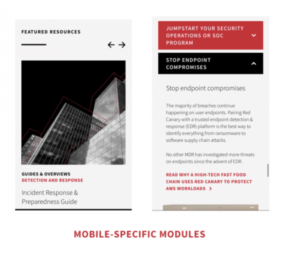
The data confirmed a key hypothesis: mobile users weren't disinterested, but rather they were frustrated. Session recordings showed people attempting to navigate, scrolling past key content, and leaving without converting. The intent was there, but the experience wasn't serving it.
The recordings made it clear that the users weren't bouncing because they didn't care, they were bouncing because they couldn't find what they came for.
Deliberate moves, not a full rebuild
Given the resource constraints and the goal of proving impact quickly, I focused on a targeted intervention approach. The question wasn't "what could we redesign?" It was "what three changes will move the metrics that matter most, with the least execution risk?" That framing kept the work focused and the dev cycles short.
UX Audit & Opportunity Mapping
Systematic review of the mobile experience against usability heuristics, benchmarked against competitor mobile sites and B2B best practices. Every finding was mapped to a user behavior from the analytics or session data.
Hypothesis Generation
Prioritized a shortlist of high-impact changes based on effort-to-impact ratio. Navigation, persistent CTA placement, and spacing rose to the top. Each hypothesis was tied to a specific data signal so the rationale was defensible.
Wireframing & Rapid Prototyping
Low-fidelity wireframes tested with internal stakeholders to pressure-test assumptions early. Followed by high-fidelity Figma prototypes for external validation through UserTesting sessions. Iteration happened fast because the scope was deliberately narrow.
Stakeholder Alignment
Presented findings and recommendations to leadership with projected impact tied to conversion goals with a deliberate data-first framing. This wasn't a pitch about design quality, but a business case with design as the lever.
Development Collaboration & QA
Worked directly with the external engineering team through implementation, providing precise specs to minimize revision cycles. Conducted thorough QA on real mobile devices before launch to ensure the experience held up outside of Figma.
Persistent sticky CTA vs. CTA within fixed content
The most contentious design decision was whether to add a persistent bottom navigation bar with a fixed "Request a Demo" button. Stakeholders were concerned about losing real estate on an already small screen. The alternative was keeping the CTA anchored within page content, surfaced at logical moments in the scroll. While both had merit, the difference came down to where we thought user intent actually lived.

Three changes. Measurable impact.
Rather than overpromise a complete overhaul, I focused the team on three targeted improvements that data suggested would have the greatest effect on mobile conversion. Each one mapped directly to a problem identified in the audit.
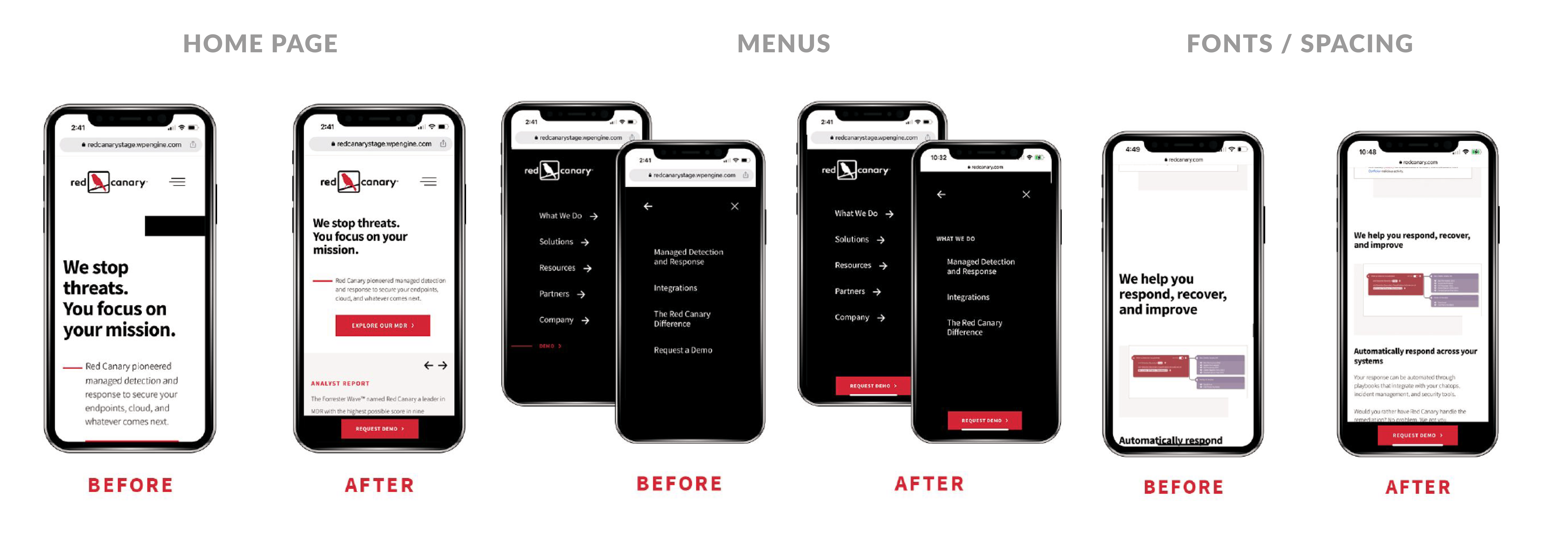
Persistent Bottom CTA
A fixed "Request a Demo" button anchored to the bottom of the screen, visible at all times. Eliminated the need to scroll or hunt for the conversion path. This was the highest-leverage change and the one with the most stakeholder resistance, which made shipping it meaningful.
Intuitive Hamburger Nav
Redesigned mobile navigation with clearer tap targets, logical content hierarchy, and a more discoverable menu trigger. The previous version required too much searching, while the new one surfaced what users actually needed within two taps.
Mobile-Optimized Spacing
Tightened and restructured padding and margins to maximize screen real estate without cramping content. The changes reduced visual noise, improved scannability, and made the overall experience feel intentional rather than adapted from desktop.
Small changes. Significant outcomes.
Post-launch analytics confirmed the hypothesis: targeted, evidence-based design changes moved the needle on the metrics that mattered most. We tracked demo page visits as the primary conversion signal, session duration as an engagement proxy, and overall mobile audience share as a reminder of the opportunity cost we had been carrying.
Beyond the numbers, the project shifted how the web team thought about mobile. What had been an afterthought became a standing consideration in every subsequent site update. Getting leadership buy-in on that mindset shift was, in some ways, a more durable outcome than any individual metric.
What this project reinforced
Every project sharpens a set of instincts. This one confirmed several principles I carry into every engagement.
Data builds the case for design. Framing recommendations in terms of measurable business outcomes, not just design rationale, was the reason this project got approved at all. In a metrics-driven organization, design without data is just opinion.
Constraints unlock focus. Working without dedicated headcount or budget forced ruthless prioritization. The results showed that doing three things well outperforms doing ten things adequately, and that constraint can be a creative input rather than just a limit.
Neglected segments often hold the biggest opportunity. Mobile users weren't disengaged, but just needed the experience to meet them. Unlocking an audience that already exists is often a faster path to impact than trying to acquire a new one.
Persistent, accessible CTAs are consistently undervalued. Making conversion effortless rather than requiring users to find it is one of the highest-ROI design decisions in a B2B context. The stakeholder resistance to losing screen real estate was the hardest part of this project, and the results made the clearest argument for why it was the right call.