Self-service doesn't have to compromise concierge attention
Arctic Wolf built its reputation on a unique positioning as a genuinely concierge-level service model. Every customer gets a dedicated security operations team, working alongside them around the clock. Launching an AI chatbot into that environment needed to be handled carefully so as not to contradict that reputation.
The Aurora Security Assistant was designed to extend the concierge model, not compete with it. The goal was a tool that would help customers navigate a complex security platform quickly, surface insights the data contained but didn't always make immediately obvious, and give users an alternative to clicking through menus to find what they needed. The tool needed to be fast, accurate, and honest about what it was.
The same core experience scaled to Arctic Wolf's internal tooling, where SOC analysts use the assistant to move more efficiently through their own platform. Analyst efficiency has a direct effect on how quickly threats get addressed. The tool needed to work for all audiences, be rooted in one design system, and maintain the same standards across the board.
I was the sole designer on the project, taking it from initial concept through two quarters of beta to general availability.
Designing for a moving target
The goal was to design an AI assistant that felt like a natural extension of the concierge experience, not a cheaper substitute for it.
The Technology Was Still Becoming Itself
Designing for an LLM without control over its training means accepting a gap between what the UI promises and what the model delivers. That gap shifted with every model update, every change in training data and every evolution in best practices across the industry. Planning too rigidly for a fixed capability set would have produced a design that aged badly. I maintained a strategy of adaptability throughout to adjust to and respond to these changing circumstances.
No Direct Customer Access for Research
Organizational infrastructure didn't support direct customer interviews during the project, so we drew insights from the feedback mechanism built into the product from beta launch, usage statistics reviewed across sessions, and interviews with internal SOC analysts running the same chatbot in their own tooling. Ultimately, their insights were applied as a representation of our most technical users, with contextual perspective to allow it to scale down as necessary.
The Biggest Structural Change Required System Work Outside My Scope
The clearest usability improvement identified during the beta, moving from a floating overlay to a page panel, required design system changes that weren't mine to make unilaterally. Designing toward a future state the team couldn't immediately ship meant documenting the direction clearly enough to carry forward, and being patient about timing while staying committed to the goal.
Learning without the users you wish you had
Working without direct customer access changed what the research process looked like, but we were able to draw some important conclusions.
Early on, I partnered with a UX researcher to gather competitive intelligence across the emerging AI assistant landscape, examining how products were handling welcome messaging, suggested prompts, feedback mechanisms, and AI disclosure patterns. That analysis, combined with established best practices, formed the framework for the initial concept and shaped what we'd ask the LLM to do.
Once the beta launched, the research model shifted. The feedback mechanism built into the product became a primary data source, capturing responses and qualitative notes across sessions. Usage statistics surfaced behavioral patterns such as which prompts were landing, where users dropped off, what the assistant was being asked that it wasn't yet handling well. Then, the interviews with internal SOC analysts added the qualitative depth that usage data alone couldn't provide.
The result was a tight loop of research and redesigns that allowed us to iterate and ship quickly to our beta users. The beta ran two full quarters before GA, allowing us to continue research with a live product.
Start usable, then iterate toward excellent
The AI assistant space didn't have years of established UX convention to draw from when this project started. Best practices were being developed alongside the products that needed them. We chose to approach the process with that truth in mind, so rather than trying to design a complete product before launch, we shipped a capable beta and let real usage data drive the improvements.
Competitive Analysis & Initial Concept
Industry analysis and competitive intelligence established a starting framework for both the UX and the LLM training inputs. The initial design introduced welcome messaging, suggested prompts, a feedback mechanism, and the core conversational interface, which were enough to launch something genuinely useful.
Beta Release
A functional, designed beta was put in front of users with feedback collection available from day one. The feedback mechanism wasn't bolted on after launch, but was designed into the product as a primary research instrument and even that component evolved over the course of the beta.
Feedback & Usage Review
Feedback mechanism responses and usage statistics were reviewed on a regular cadence. Patterns in what was working and what wasn't drove the priorities for each subsequent iteration cycle.
Internal User Interviews
SOC analysts using the assistant in internal tooling were interviewed for qualitative depth. Their needs weren't identical to customer users, but they were close enough to validate or challenge assumptions that usage data alone couldn't resolve.
Rapid Iteration Cycles
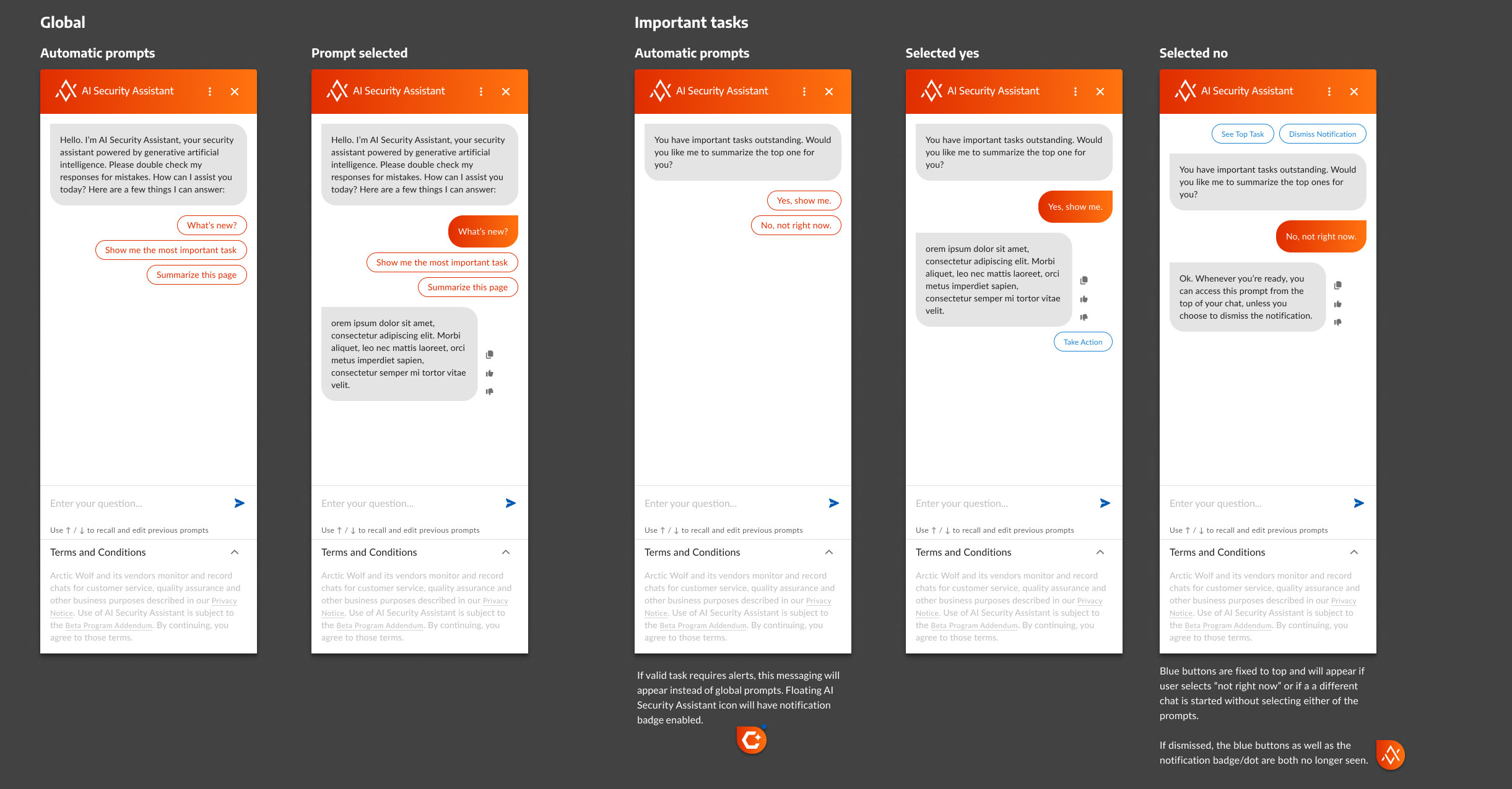
Design changes shipped in quick succession across the beta period, including the refinement of prompt suggestions, modifying the feedback mechanism to encourage responses, a shift from consumer-orange to enterprise-navy, expanding the window options for extended content needs, and providing help documentation integrated directly into the chat experience.
Ship an iterable beta rather than a polished v1
An AI assistant is a product category where the gap between designed intent and real-world behavior is uniquely hard to predict. No amount of pre-launch research could substitute for what actual usage data would reveal. Shipping the beta early got the research loop running months before a delayed launch would have allowed, and the patterns that loop surfaced were exactly what drove the improvements that led to GA.
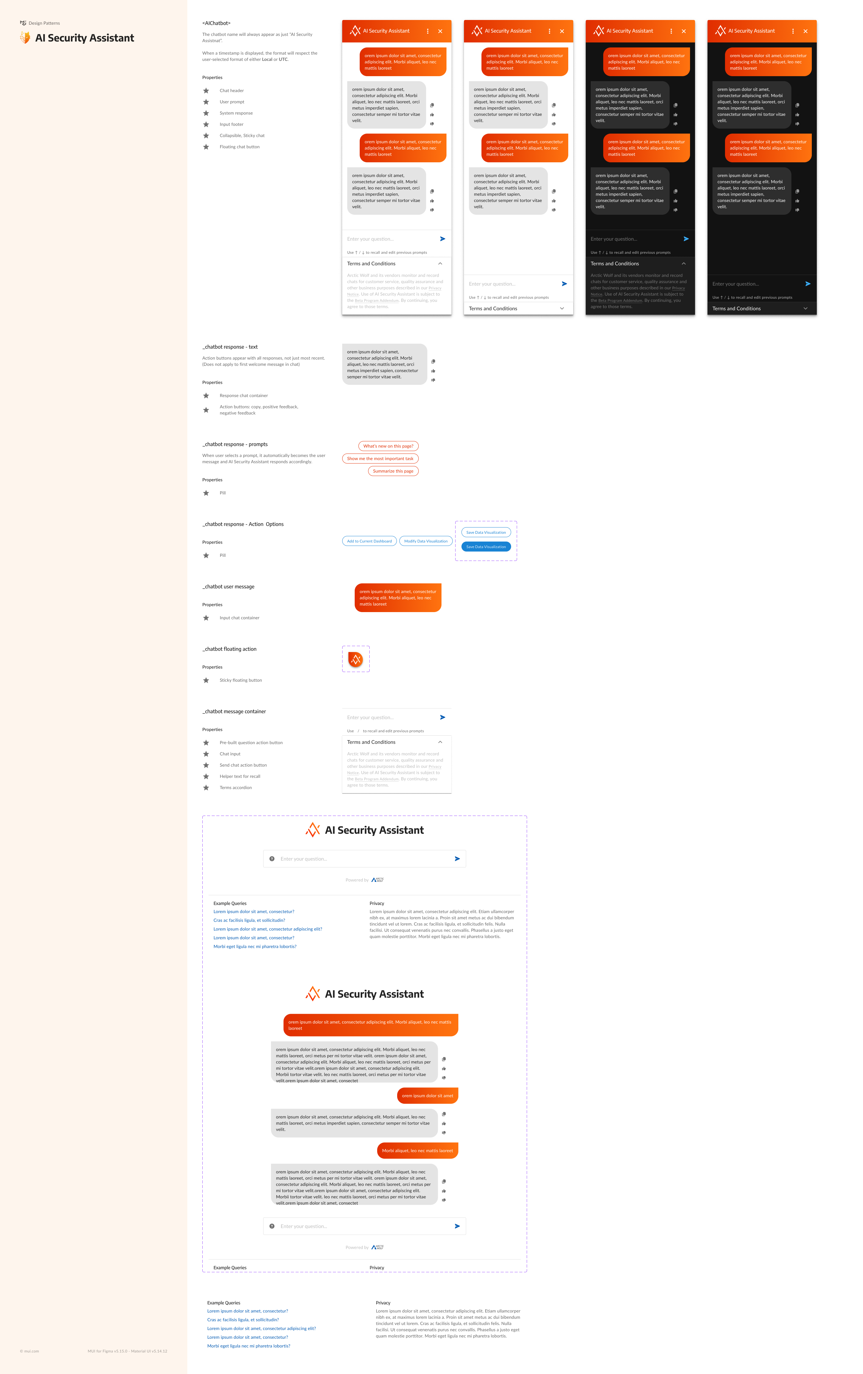
A system for every AI touchpoint
The chatbot itself was only part of the design challenge. As the assistant became a real part of how users moved through the platform, it raised a broader question: how should the rest of the portal surface AI capabilities consistently?
I led a complete audit to identify every place in the platform where a user could benefit from calling on the assistant directly, documenting instances and opportunity types across multiple product areas. The goal wasn't just to catalog them, but rather to synthesize them into a reusable pattern set that would scale regardless of what features came next.
Drawing on competitive analysis, internal feedback, and cross-functional team input, I defined six patterns that cover the full range of AI interaction needs across both the customer portal and internal tooling.
Access Points & Context Scoping
Defines where and how users can open the assistant, including iconography, variant types, and how contextual information should be pre-loaded so the first exchange is useful immediately rather than requiring the user to re-establish context.
Contextual Triggers
Patterns for when the assistant proactively surfaces itself based on user context, such as flagged tasks, pending incidents, or page-specific relevance. Defines the threshold between helpful and intrusive.
AI-Generated Summary & Insight Displays
How AI-synthesized content appears within the portal UI, including structure, visual treatment, and the visual distinction between AI-generated and human-authored content in shared spaces.
AI-Powered Recommendations & Suggestions
Patterns for surfacing next-best-action prompts and recommendations within context, from alert cards to dashboard widgets, in a way that guides without overwhelming.
AI Disclosures
Where and how to communicate what is and isn't AI-generated, balancing transparency requirements with readability across different surface types and interaction contexts.
Iconography & Visual Variants
A consistent visual language for AI-related elements across the platform, with variant definitions that account for different contexts, sizes, and interaction states without fragmenting the system.
These six patterns became a formal contribution to the product design system, giving the platform a shared language for AI interactions that extends well beyond the chatbot itself. Any team building AI-powered features can reference the same framework for structuring access points, writing disclosures, or surfacing recommendations, without starting from scratch or producing experiences that feel disconnected from the rest of the product. Beyond this audit, I have contributed extensively to the broader design system at Arctic Wolf, including component-level specifications, interaction standards, and documentation that supports consistent work across distributed teams.
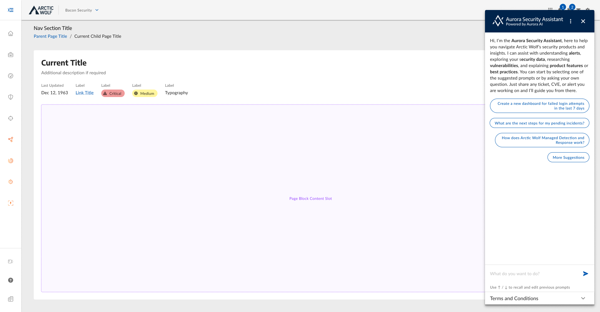
Aurora Security Assistant, GA
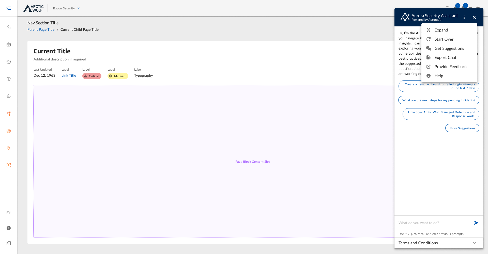
The GA product ships as a right-side panel that opens within the portal without displacing the content the user is working in. Enterprise dark theme, context-aware suggested prompts, a structured welcome message that sets expectations, and a conversational interface built specifically for security work: alerts, incidents, dashboards, CVEs, product questions.
The design carries the full weight of the iteration cycles that preceded it. Suggested prompts are tuned to the contexts where they're most likely to match what users are actually looking for. The feedback mechanism is a first-class part of the interface, not an afterthought. Help documentation is integrated directly, so troubleshooting and product education happen in the same place as security queries. And a utility menu with options to expand, start over, export a chat, or get fresh suggestions gives power users what they need without exposing that complexity by default.
The same design runs in Arctic Wolf's internal tooling for SOC analysts. Two audiences, one interaction model, the same standards applied to both.
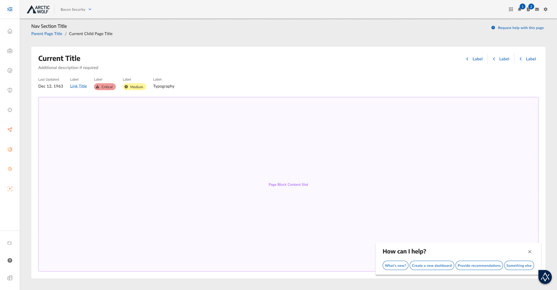
From floating to embedded
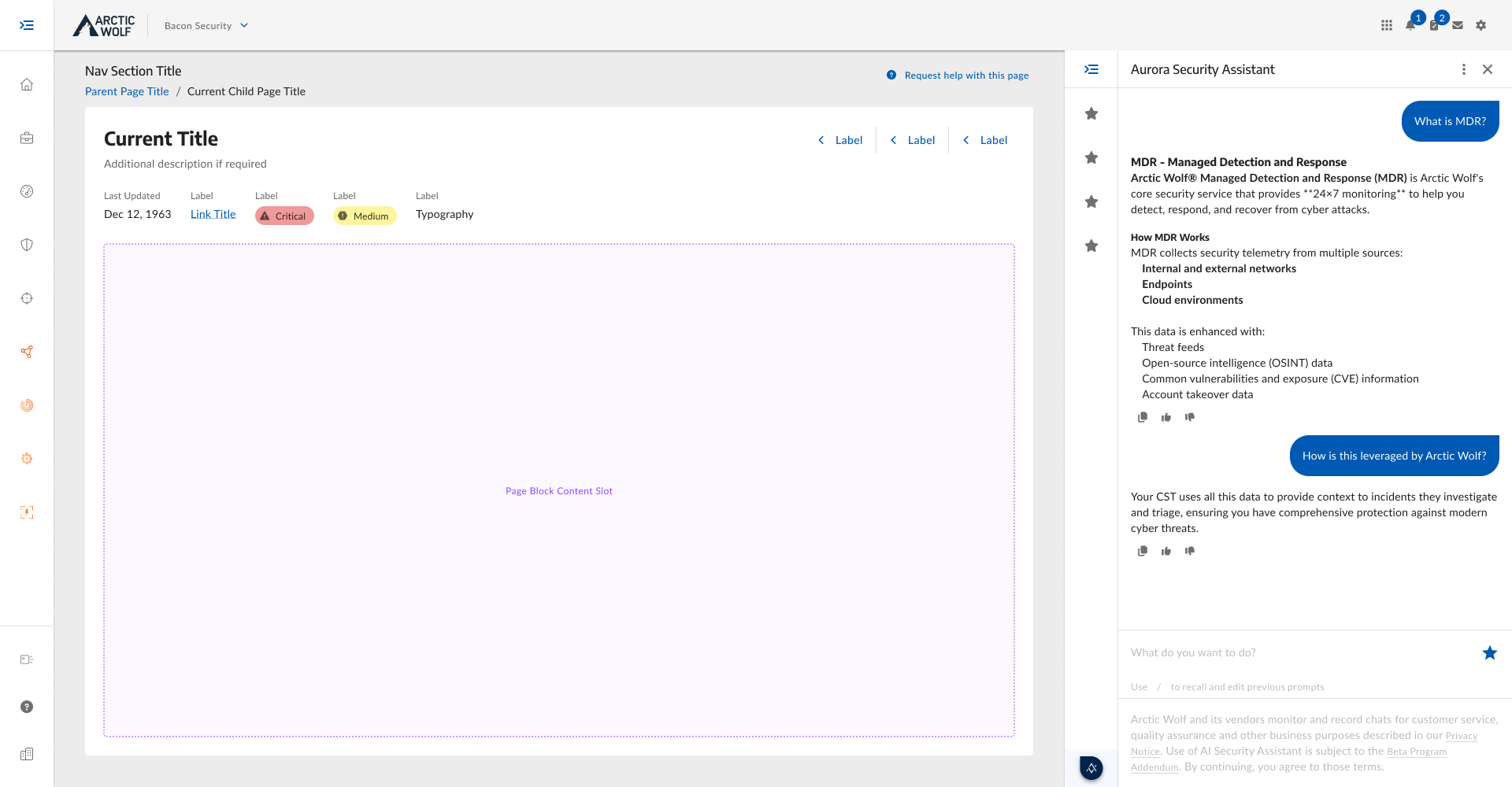
The biggest piece of feedback we gleaned during beta and post-GA, was that users want to use the assistant and look at their data at the same time. The floating module forces a choice and users were repeatedly closing and reopening the chatbot, often abandoning it completely.
The next iteration shifts the assistant from a floating overlay to an embedded side panel, a true column alongside the portal content rather than a layer on top of it. Users can run a conversation, refer to whatever is in front of them, and act on both without closing or resizing anything. The interaction model stays the same, but the relationship to the page changes significantly.
The design direction is set and the specs are ready, but implementing it requires design system changes that are in progress outside the immediate design scope. When they ship, the page panel follows.
What AI products teach you that other products don't
AI product design doesn't come with a playbook, and that's the point. Most design problems benefit from years of established patterns and comparative data, but AI products in emerging categories don't have those yet. The conventions are being written in real time. That means being comfortable making decisions under more uncertainty than usual, staying close to what the data is actually showing, and building processes flexible enough to absorb meaningful change mid-cycle. The discomfort of not knowing is often only alleviated or validated once the product has been put in front of users.
Plan for the technology to change during the project. LLM capabilities shifted during the beta as the technology and our organization's leverage of it evolved. What counted as a strong interaction pattern in one quarter required rethinking in the next. A design too tightly coupled to the current state of the model sets up the next iteration for unnecessary friction. Modular, adaptable UX gives the product room to grow alongside the technology rather than fighting it.
When you can't interview the users you need, build the research instrument into the product. Without direct customer access, we relied on the feedback mechanism as more than just a customer trust mechanism, but as a primary data source. Designing it thoughtfully, making it easy to reach, low friction to complete, and generating useful signal, made it more valuable as a research tool. If your typical research methods aren't available, the product itself can still generate the data you need, as long as you design it to from the start.